
The 2019 MCM/ICM was the first time they had a data problem. I thought it would be fun to use this data to learn how to use ggplot2 to create maps. Using dplyr, ggplot2 and sf make it really easy to create visualizations to see what is happening spatially.
library(tidyverse)
library(sf)
drug.use = read_csv("opiate_files/MCM_NFLIS_Data.csv")Lets do some very basic data exploration. Perhaps the first question is how many zip codes do I have by year?
drug.use%>%
  count(YYYY)
## # A tibble: 8 x 2
## YYYY n
## <int> <int>
## 1 2010 2836
## 2 2011 2701
## 3 2012 2764
## 4 2013 2861
## 5 2014 2860
## 6 2015 2858
## 7 2016 3329
## 8 2017 3853How about by year and state?
drug.use%>%
  count(YYYY,State)%>%
  spread(State,n)
## # A tibble: 8 x 6
## YYYY KY OH PA VA WV
## <int> <int> <int> <int> <int> <int>
## 1 2010 624 686 501 822 203
## 2 2011 647 682 522 624 226
## 3 2012 665 660 502 696 241
## 4 2013 634 639 496 861 231
## 5 2014 710 704 485 739 222
## 6 2015 667 805 525 675 186
## 7 2016 708 957 620 842 202
## 8 2017 774 1221 711 959 188It seems that we do not have the same number of zip codes each year.
First I am going to look at 2010 and 2017 to see if there has been a significant change over time. I believe it might be easier to first look at counties, but then I will expand into zip codes. I will start with Ohio because in the news it seems to have a lot of problems with opiates.
Ohio.Avg.10 = drug.use%>%
  filter(State=="OH")%>%
  filter(YYYY==2010)%>%
  group_by(COUNTY)%>%
  summarise(Mean.Drug.Reports = mean(DrugReports))
Ohio.Avg.17 = drug.use%>%
filter(State=="OH")%>%
filter(YYYY==2017)%>%
group_by(COUNTY)%>%
summarise(Mean.Drug.Reports = mean(DrugReports))Sometimes it is nice to look at spatial data on a map. I am going to read in a “.shp” (a shapefile). This will allow me to create a map of Ohio. The shapefile can be found at
OH.map = st_read("opiate_files/REFER_COUNTY.shp")## Reading layer `REFER_COUNTY' from data source `C:\Users\Bryan.Adams\Desktop\Research\myblog\content\post\opiate_files\REFER_COUNTY.shp' using driver `ESRI Shapefile'
## Simple feature collection with 88 features and 23 fields
## geometry type: MULTIPOLYGON
## dimension: XY
## bbox: xmin: -9442133 ymin: 4636534 xmax: -8963324 ymax: 5157571
## epsg (SRID): 3857
## proj4string: +proj=merc +a=6378137 +b=6378137 +lat_ts=0.0 +lon_0=0.0 +x_0=0.0 +y_0=0 +k=1.0 +units=m +nadgrids=@null +wktext +no_defsOH.map%>%
ggplot()+
geom_sf()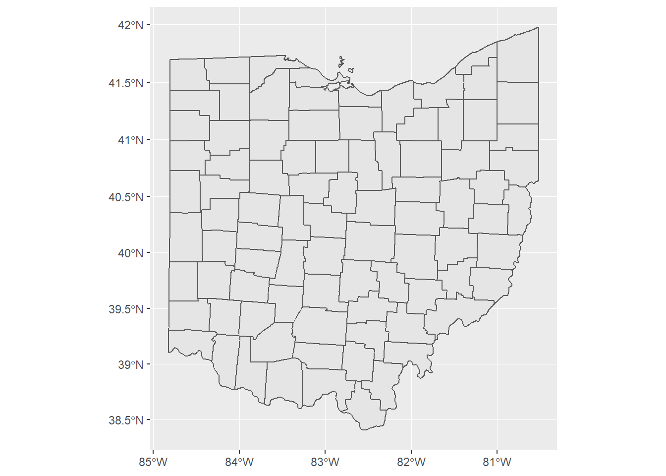
Next I am going to fill the counties by average opiate cases.
opiate.map.2010 = OH.map%>%
  full_join(Ohio.Avg.10, by  = "COUNTY")

opiate.map.2017 = OH.map%>%
  full_join(Ohio.Avg.17, by  = "COUNTY")
opiate.map.2010%>%
ggplot()+
geom_sf(aes(fill = Mean.Drug.Reports))+
scale_fill_gradient2(low = "green",
high = "red",
midpoint = 100)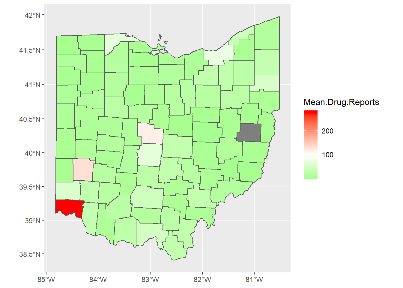
opiate.map.2017%>%
ggplot()+
geom_sf(aes(fill = Mean.Drug.Reports))+
scale_fill_gradient2(low = "green",
high = "red",
midpoint = 100)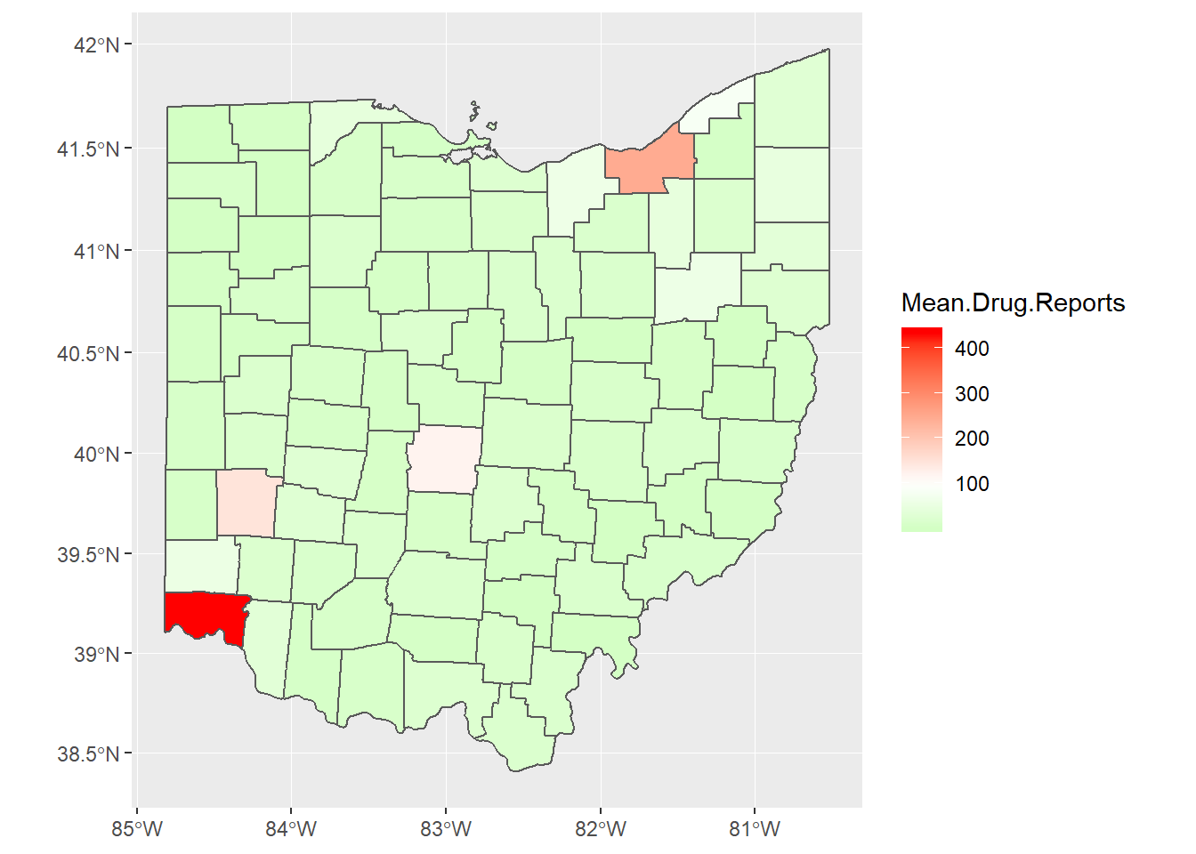
Now I am going to make the map look really nice by overlaying the roads and cities.
Ohio.Roads = st_read("opiate_files/WGIS_STS_HIGHWAY.shp")## Reading layer `WGIS_STS_HIGHWAY' from data source `C:\Users\Bryan.Adams\Desktop\Research\myblog\content\post\opiate_files\WGIS_STS_HIGHWAY.shp' using driver `ESRI Shapefile'
## Simple feature collection with 219 features and 11 fields
## geometry type: MULTILINESTRING
## dimension: XY
## bbox: xmin: -9442126 ymin: 4637255 xmax: -8963350 ymax: 5151581
## epsg (SRID): 3857
## proj4string: +proj=merc +a=6378137 +b=6378137 +lat_ts=0.0 +lon_0=0.0 +x_0=0.0 +y_0=0 +k=1.0 +units=m +nadgrids=@null +wktext +no_defsOhio.Cities = st_read("opiate_files/REFER_CITY.shp")## Reading layer `REFER_CITY' from data source `C:\Users\Bryan.Adams\Desktop\Research\myblog\content\post\opiate_files\REFER_CITY.shp' using driver `ESRI Shapefile'
## Simple feature collection with 933 features and 16 fields
## geometry type: MULTIPOLYGON
## dimension: XY
## bbox: xmin: -9442130 ymin: 4636673 xmax: -8963345 ymax: 5157614
## epsg (SRID): 3857
## proj4string: +proj=merc +a=6378137 +b=6378137 +lat_ts=0.0 +lon_0=0.0 +x_0=0.0 +y_0=0 +k=1.0 +units=m +nadgrids=@null +wktext +no_defsOhio.Cities%>%
filter(POP_2010>=100000)%>%
st_centroid()%>%
ggplot()+
geom_sf()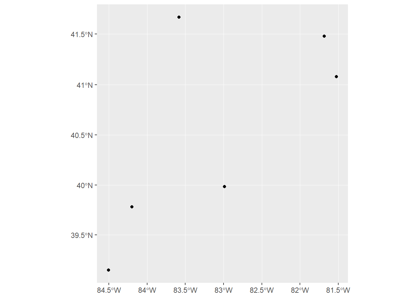
opiate.map.2010%>%
  ggplot()+
  geom_sf(aes(fill = Mean.Drug.Reports))+
  scale_fill_gradient2(low = "green",
                       high = "red",
midpoint = 100)+
geom_sf(data = Ohio.Roads, color = "blue")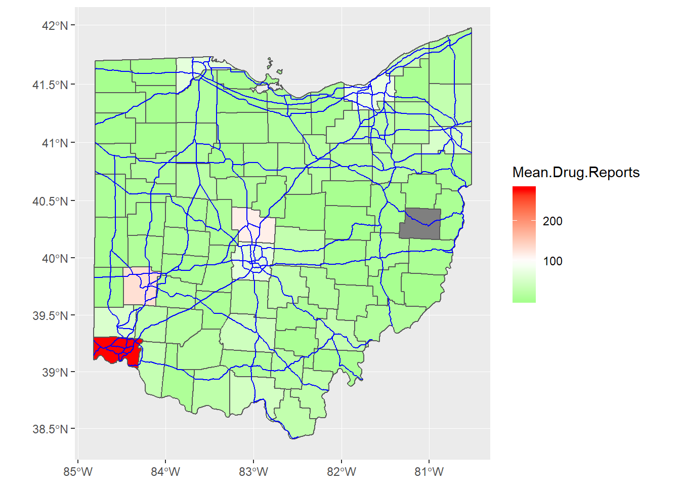
Now lets say I want to do it for multiple states. Each state generally provides its own shapefiles with different information. The unfortunate aspect is that they sometimes do not contain the same structure. fortunately the US government has established a large database of shape files at census.gov. Now I do not need to map every state, only the states I am interested in. This file contains states “FIPS” codes. This code numbers the states alphabetically and is used for census purposes.
US_County_Map = read_sf("opiate_files/tl_2018_us_county.shp")

US_County_Map%>%
  filter(STATEFP%in%c(21,39,42,51,54))%>%
  ggplot()+
  geom_sf()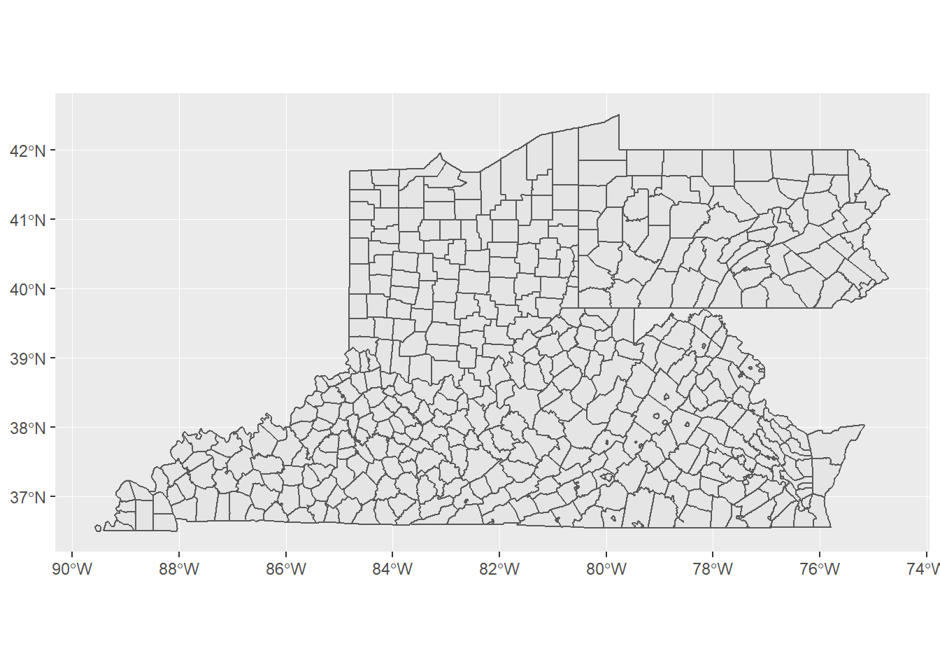
Now we have a map for all of the counties that could be in the data set. I am going to take every county’s data and merge it with the map and make a map similar to the Ohio map. I will have to make some changes to each file to assist.
avg_drug_use = drug.use%>%
  group_by(FIPS_State,COUNTY,YYYY)%>%
  summarise(Mean.Drug.Reports = mean(DrugReports))%>%
  rename(STATEFP = FIPS_State)%>%
  ungroup()%>%
  mutate(STATEFP = as.character(STATEFP))%>%
  mutate(COUNTY = Hmisc::capitalize(tolower(COUNTY)))

full_map_data = US_County_Map%>%
  filter(STATEFP%in%c(21,39,42,51,54))%>%
  rename(COUNTY = NAME)%>%
  mutate(COUNTY = Hmisc::capitalize(COUNTY))%>%
  full_join(avg_drug_use, by = c("STATEFP","COUNTY"))
Now I can make a map for 2010.
full_map_data%>%
  filter(YYYY == 2010|is.na(YYYY))%>%
  ggplot()+
  geom_sf(aes(fill = Mean.Drug.Reports))+
  scale_fill_gradient2(low = "green",
                       high = "red",
                       midpoint = 100)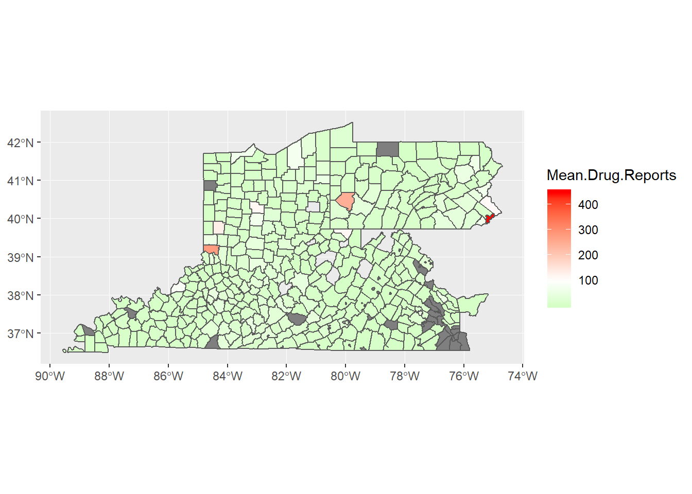
Now I would like to see it for 2010 - 2017 and identify where are opiate cases spreading.
full_map_data%>%
  filter(!is.na(YYYY))%>%
  ggplot()+
  geom_sf(aes(fill = Mean.Drug.Reports))+
  scale_fill_gradient2(low = "green",
                       high = "red",
                       midpoint = 100)+
  facet_wrap(~YYYY)+
  labs(title = "How are opiate cases spreading?",fill = "Average (by zip code) \n reported opiate cases")+
  theme(axis.text.x = element_text(angle = 45, hjust = 1))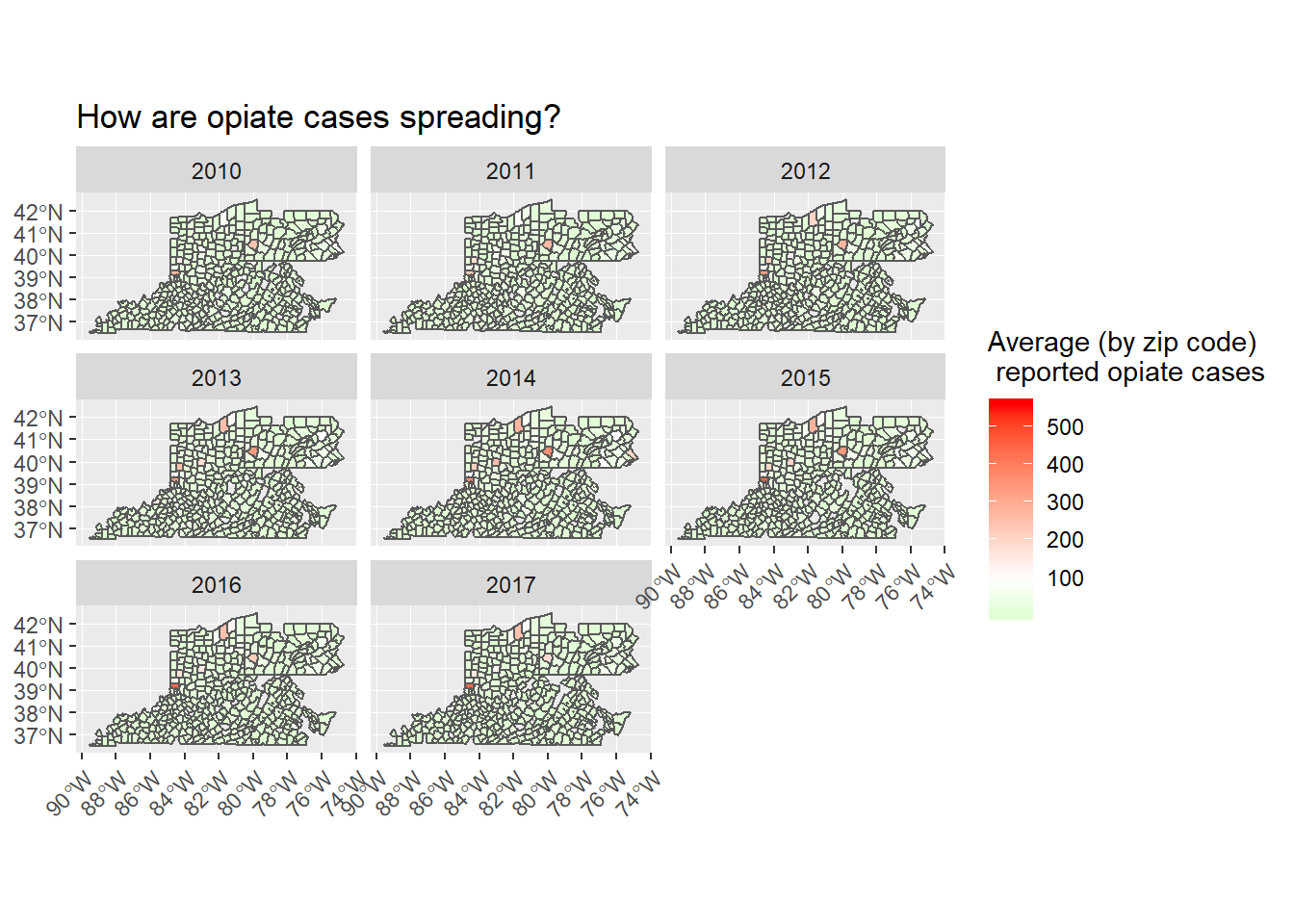
Twitter
Facebook
Reddit
LinkedIn
StumbleUpon
Pinterest
Email